2018
THE STANDARD HOTEL
 Visual Identity System
Print
Motion
Special Thanks:
Fiona Blankenship(instructor)
at ArtCenter College of Design
Brief:
The Standard Hotels are a group of five boutique hotels in Los Angeles (Hollywood and Downtown LA), New York City (The High Line and East Village), and Miami Beach. It is a firm that has pioneered the hospitality industry for 18 years based on its careful design consideration, detail, and service, establishing its reputation in travel, nightlife, dining, and beyond. However, the need to rebrand comes with the changes in marketing plans, customers’ needs, and perceptions of the clients.
Goal:
The project aims to refresh the brand identity by repositioning the personality of The Standard Hotel, which is a combination of modern, fashionable, artistic, and urban. Enhancing this personality will help the company achieve its dreams and fulfill the needs of its clients.
Logo Inspirations:
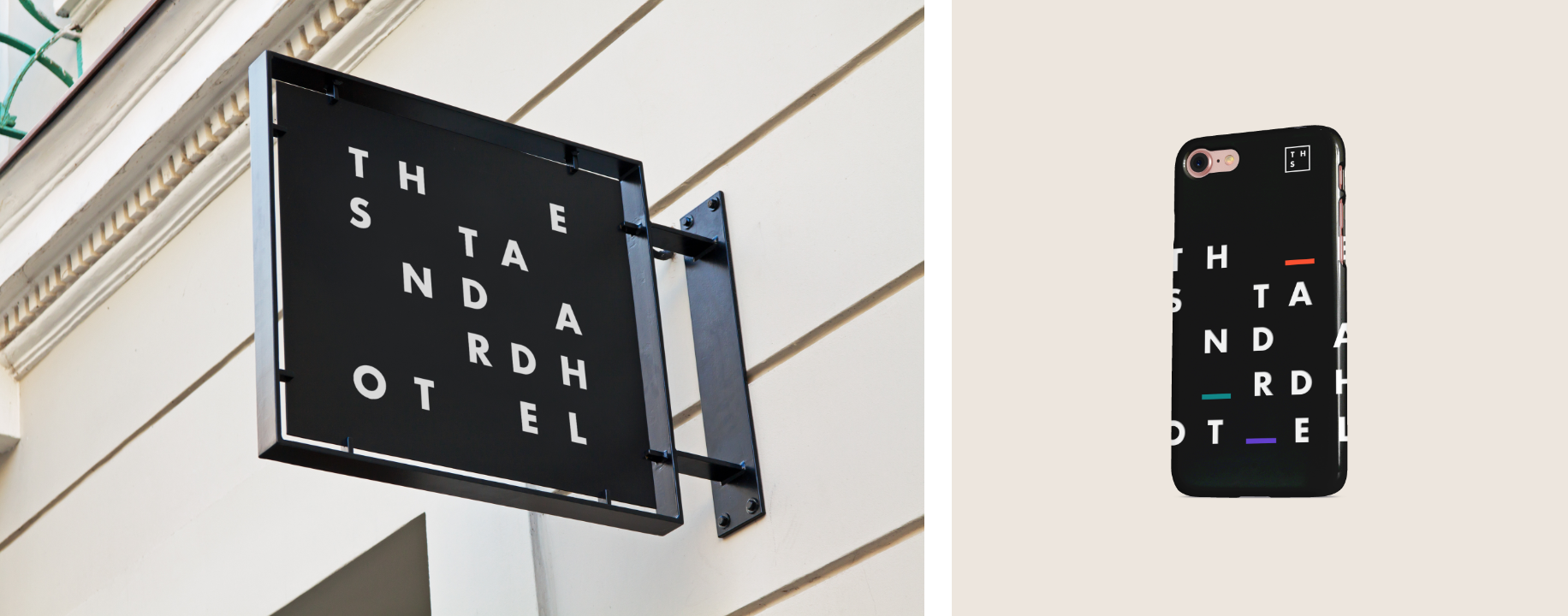
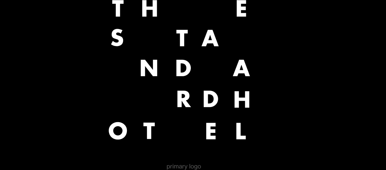
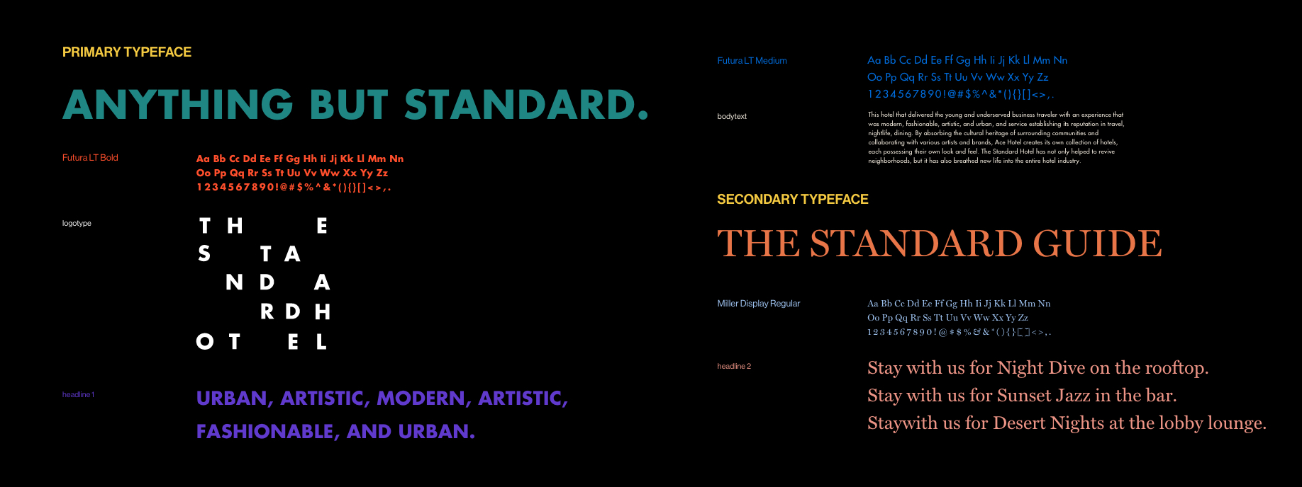
The rebranding concept came from the culture, urban city, music, fashion, and contemporary art. When creating the logo, I was inspired by the aesthetically golden ratio, which can be found in many pieces of art, including contemporary architecture and the dynamic rhythm of music.

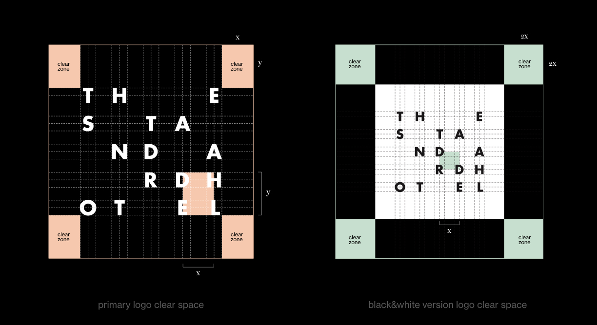
Logo Configuration:
The guidelines are a tool created to help you build The Standard Hotel brand and ensure that our mark always leaves a great impact. It should be used consistently and respectfully. Consistent use of these guidelines helps reinforce the promise we make to clients.


Target Audiences:
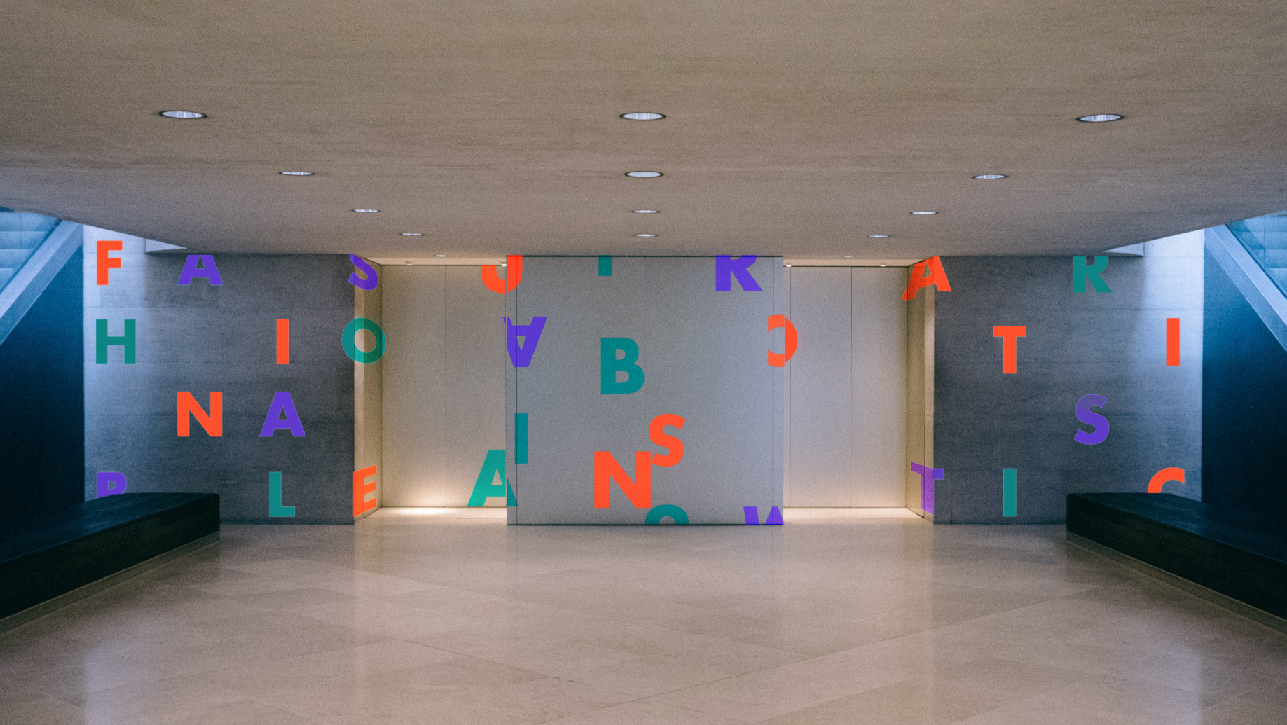
This hotel focuses on the young and underserved business travelers. The image portrayed in the rebranding is premium, welcoming, modern and fashionable, creative, memorable, unique, and creates a social and interactive environment based on the proposed brand.

Creative Considerations:
Urban Stay, Smart Luxury. Urban Stay offers modern travelers a vibrant and pulsating blend of innovative ideas that are far removed from cumbersome hospitality and the conventional charm of hotel chains.
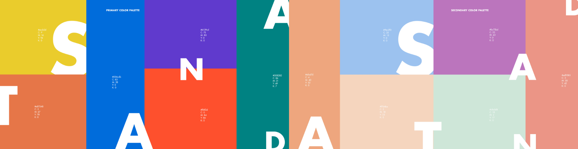
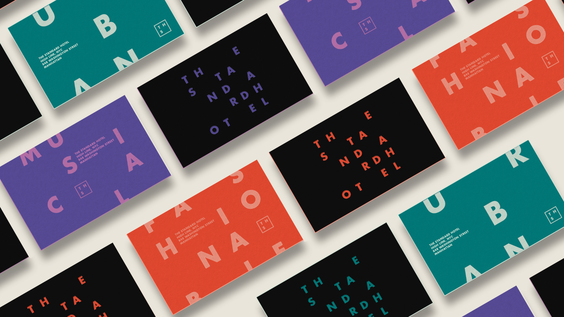
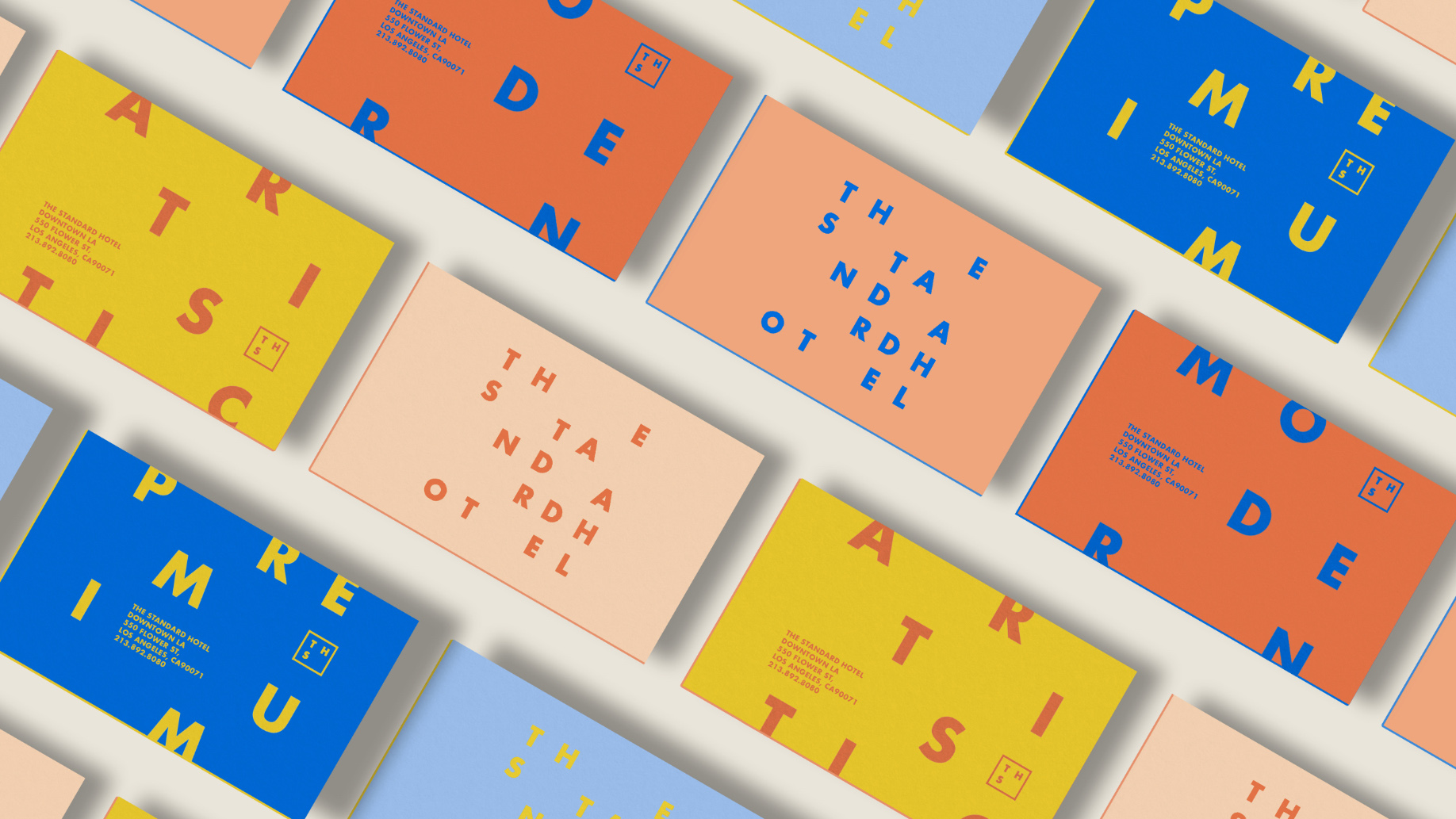
Color Inspirations:
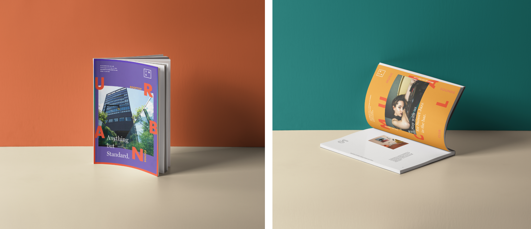
The two color palettes were based on the urban cities of the two locations: downtown Los Angeles—sunset, beach, sky, diverse, vibrant, relaxed, and rich with arts—and The High Line in New York—culture, music, glitter, light, club, fashion, and art.


Posters:
I wanted to create a new category of hotels that delivered an experience that was “anything but standard” to the young and underserved business travelers. The Standard Hotels of different stunning destinations speak a different culture and brand voice to their audience; each one is unique yet still unmistakably “standard.” Posters are the whole rich visual language.

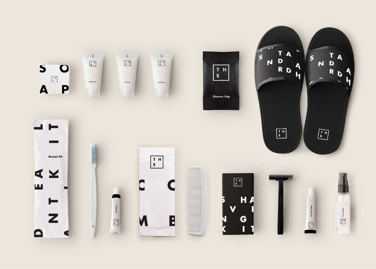
Hotel Amenities:
Travelers will experience a personalized brand lifestyle by timeless hotel amenities through different destinations. Some of the key constants across all The Standard Hotels are the visual experiences and sensory properties, such as the scent, touch, and consistency. Using only black and white with the typography and basing it on the new brand grid system achieves an innovative and coherent vision.