2019
NANNA DITZEL EXHIBITION
 Exhibition Design
 Spatial Design
 Storytelling
 Physical Modeling
 3D Modeling
 3D Rendering
Special Thanks:
Wayne Hunt(instructor)
at ArtCenter CollegTe of Design
Location:
1111 S Arroyo Pkwy, Pasadena,
CA 91105
Brief:
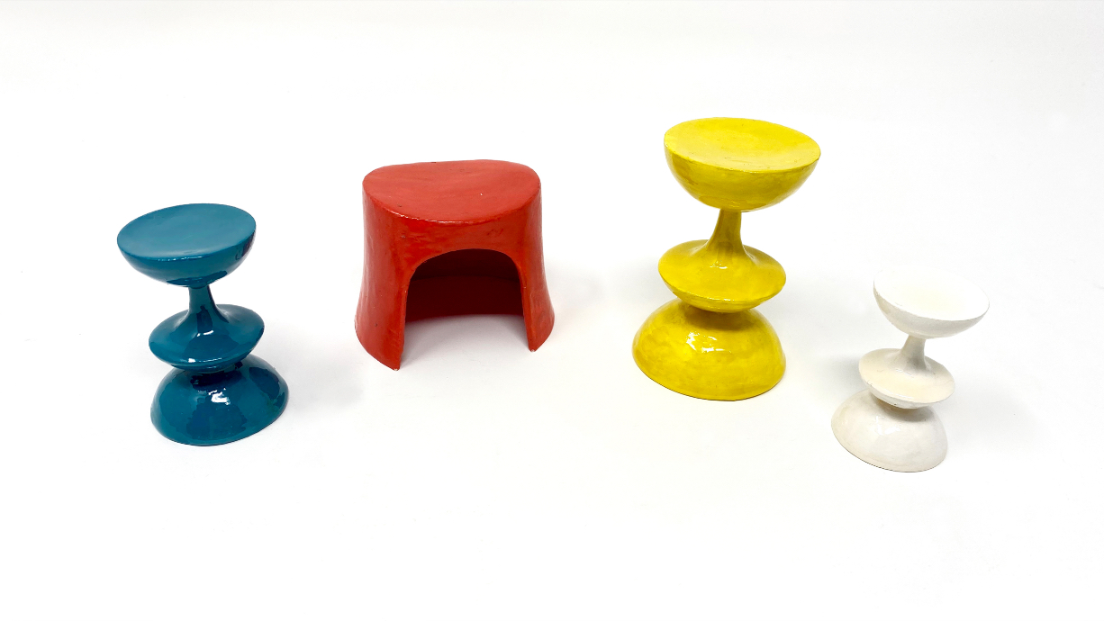
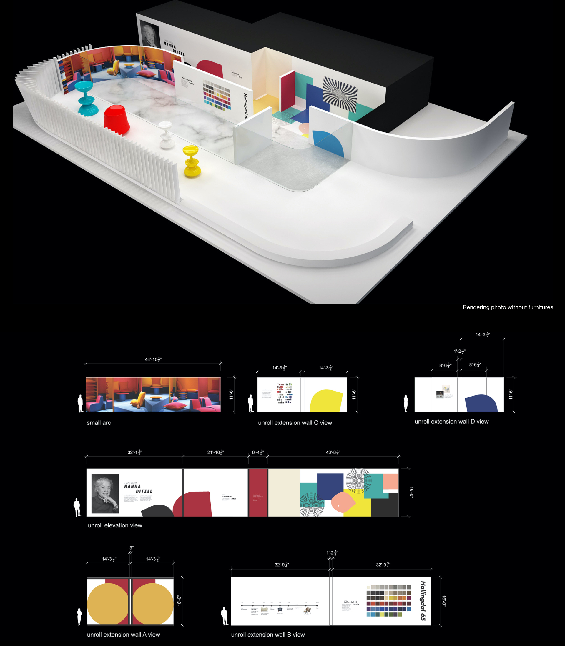
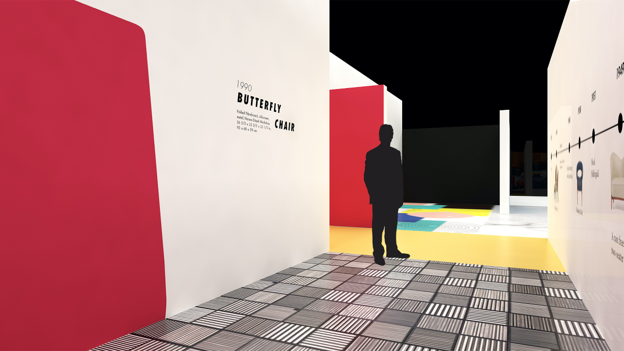
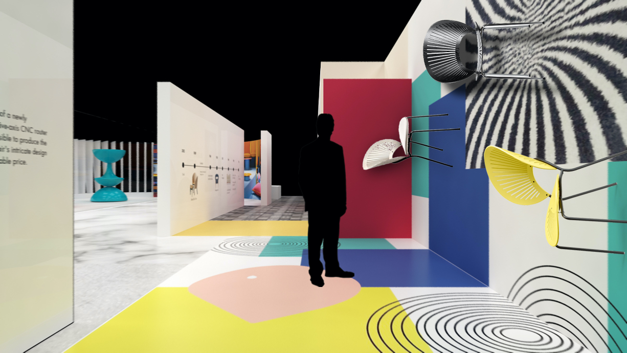
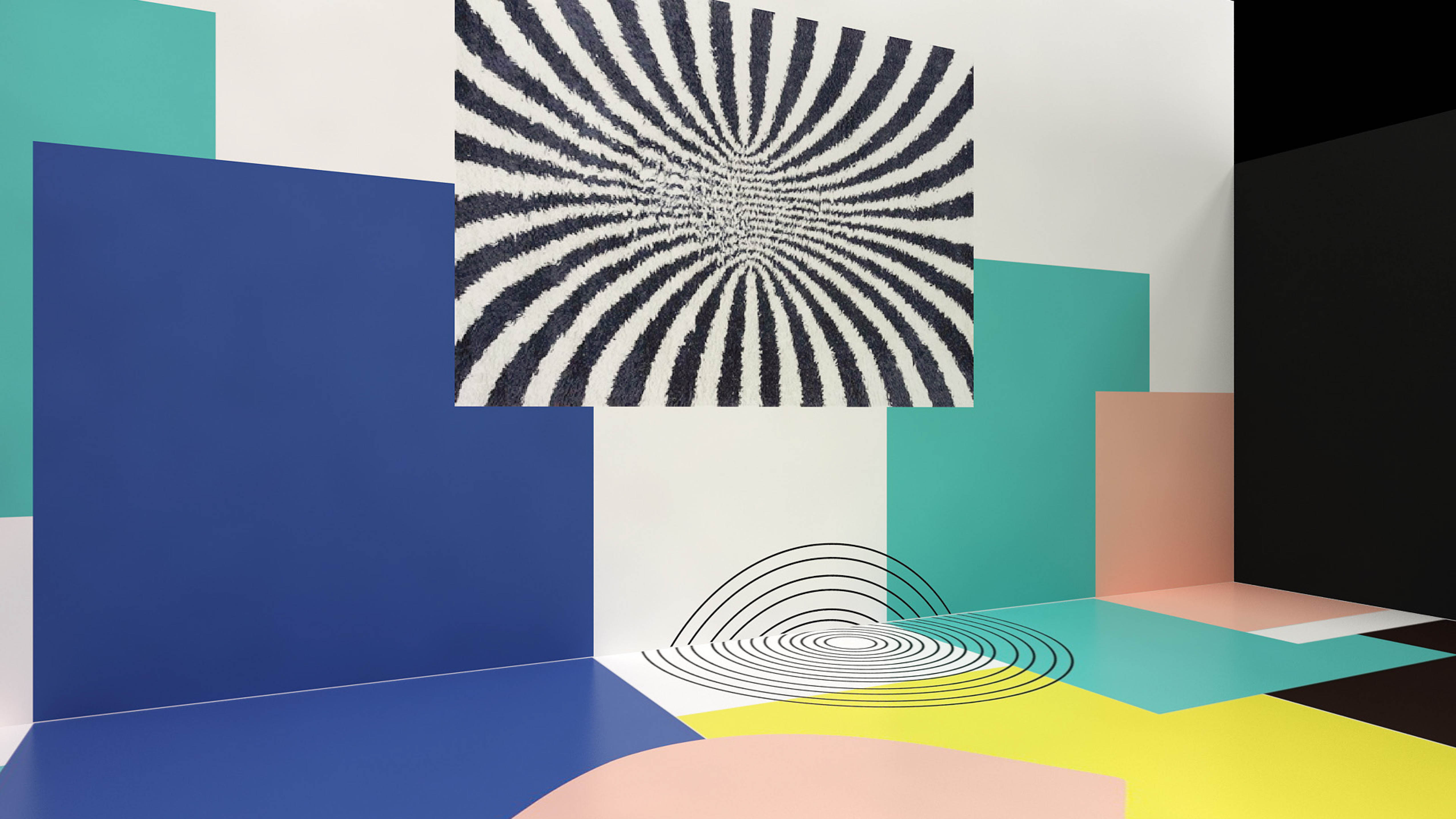
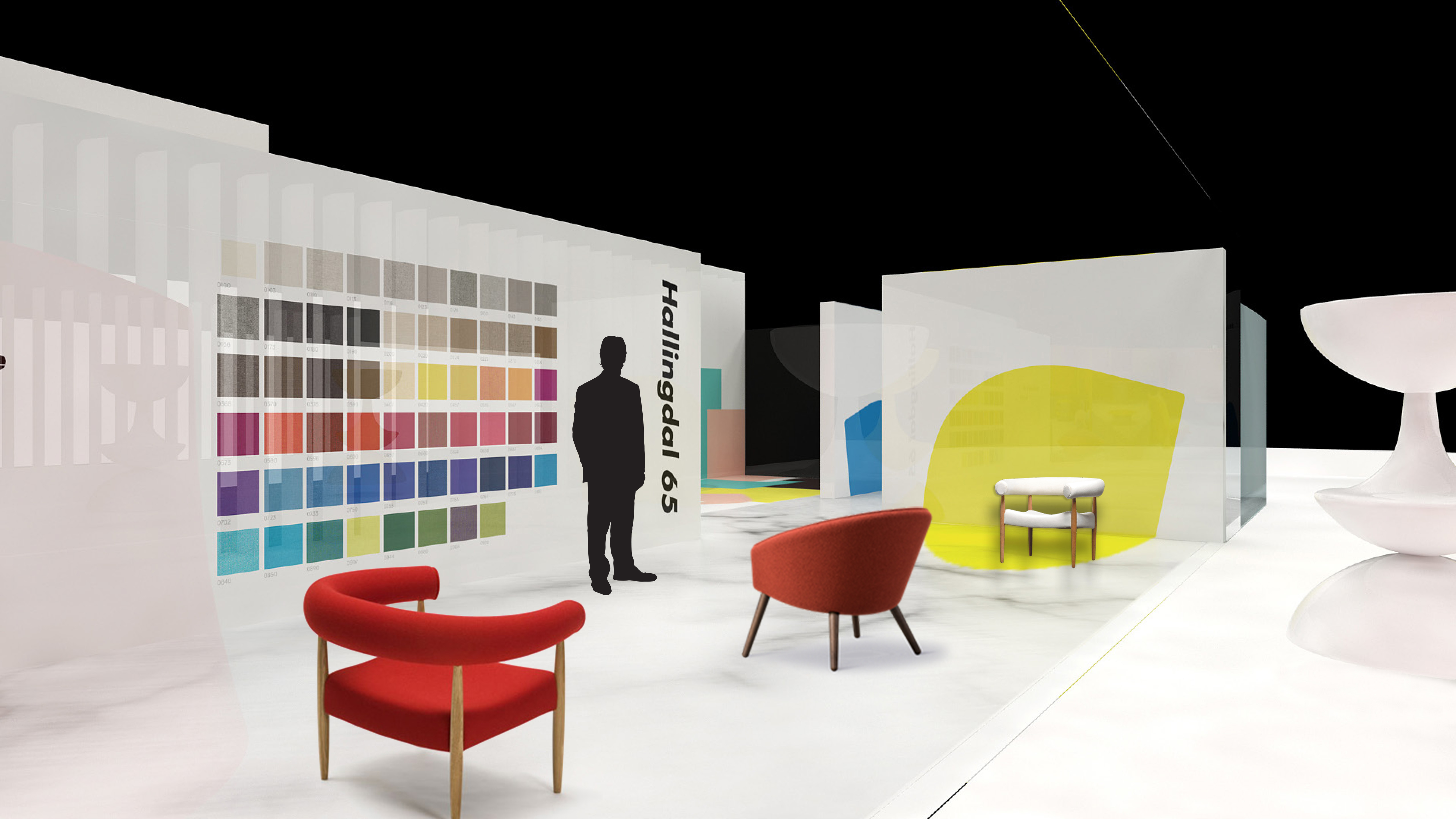
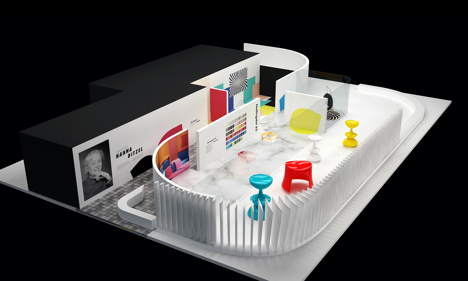
This is a hypothetical exhibition design project about the Danish Designer, Nanna Ditzel. Curated, planned, and designed, this is an exhibition space based on the Peter and Merle Mullin Gallery. The final deliverable was a 1/4” scale physical model and 3D installations. Designed spatial layout, typography, spatial sequence, proportion, and storytelling.
Learning Objective:
Staging information in physical space; exhibit design; spatial sequence; human scale; storytelling.


Research of the Space:
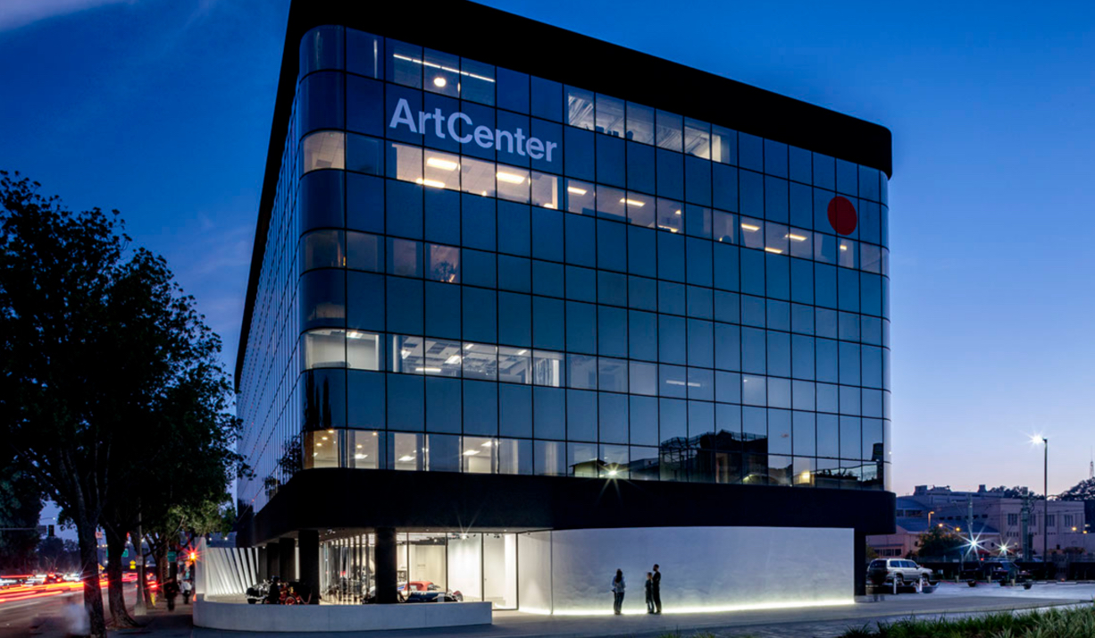
The modest 6,300 square foot gallery space is programmed to function alternatively as both a fine art gallery and, what it currently is, an automotive gallery, in keeping with the donor’s passions and prolific car collection. These curving walls organize the interior gallery and the exterior courtyard, including a 12-foot-tall steel blade “fence.”


Research of Nanna Ditzel:
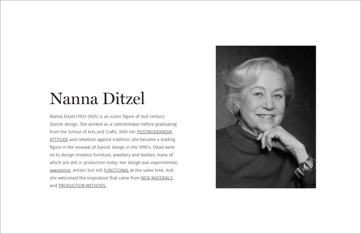
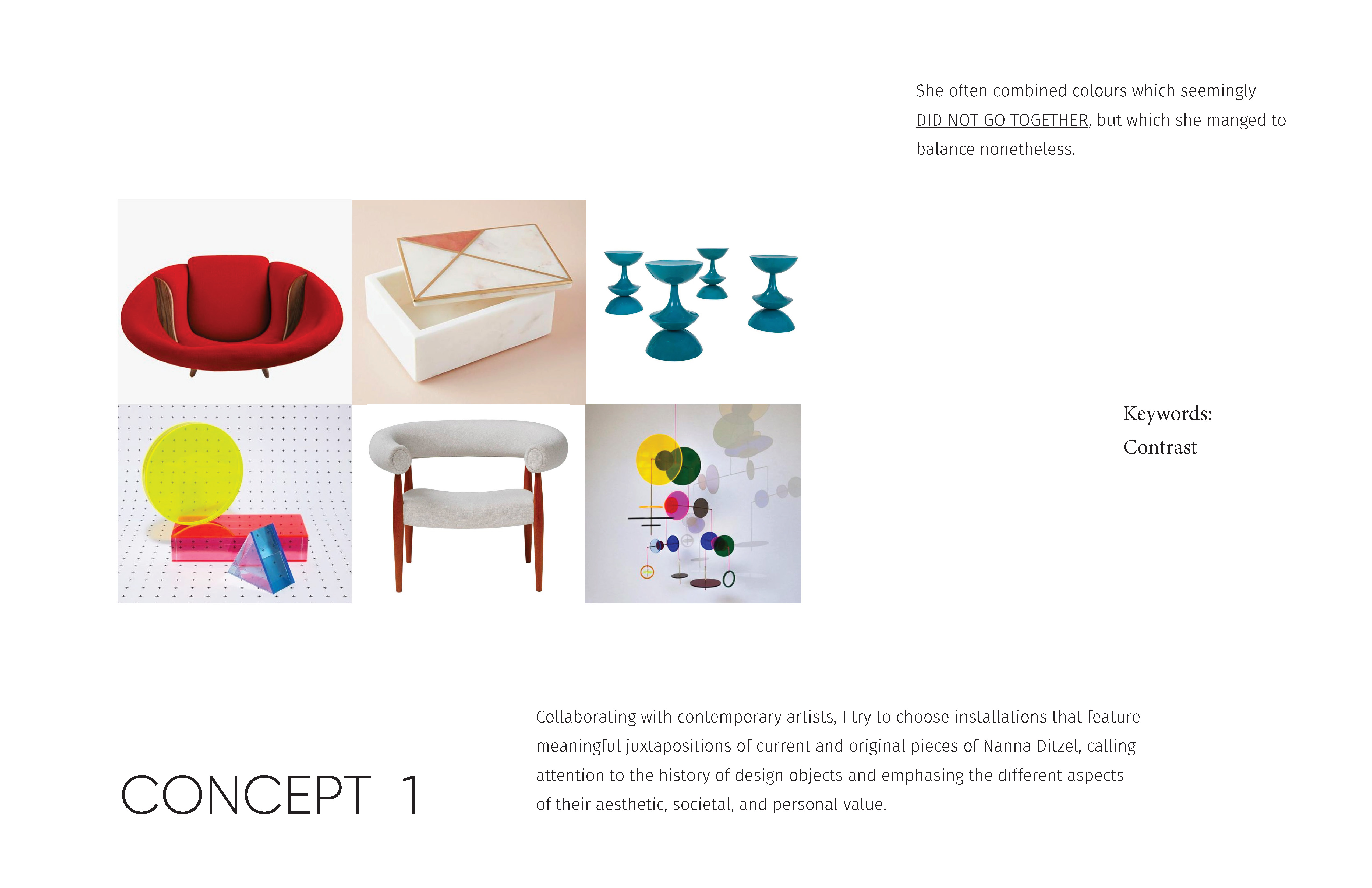
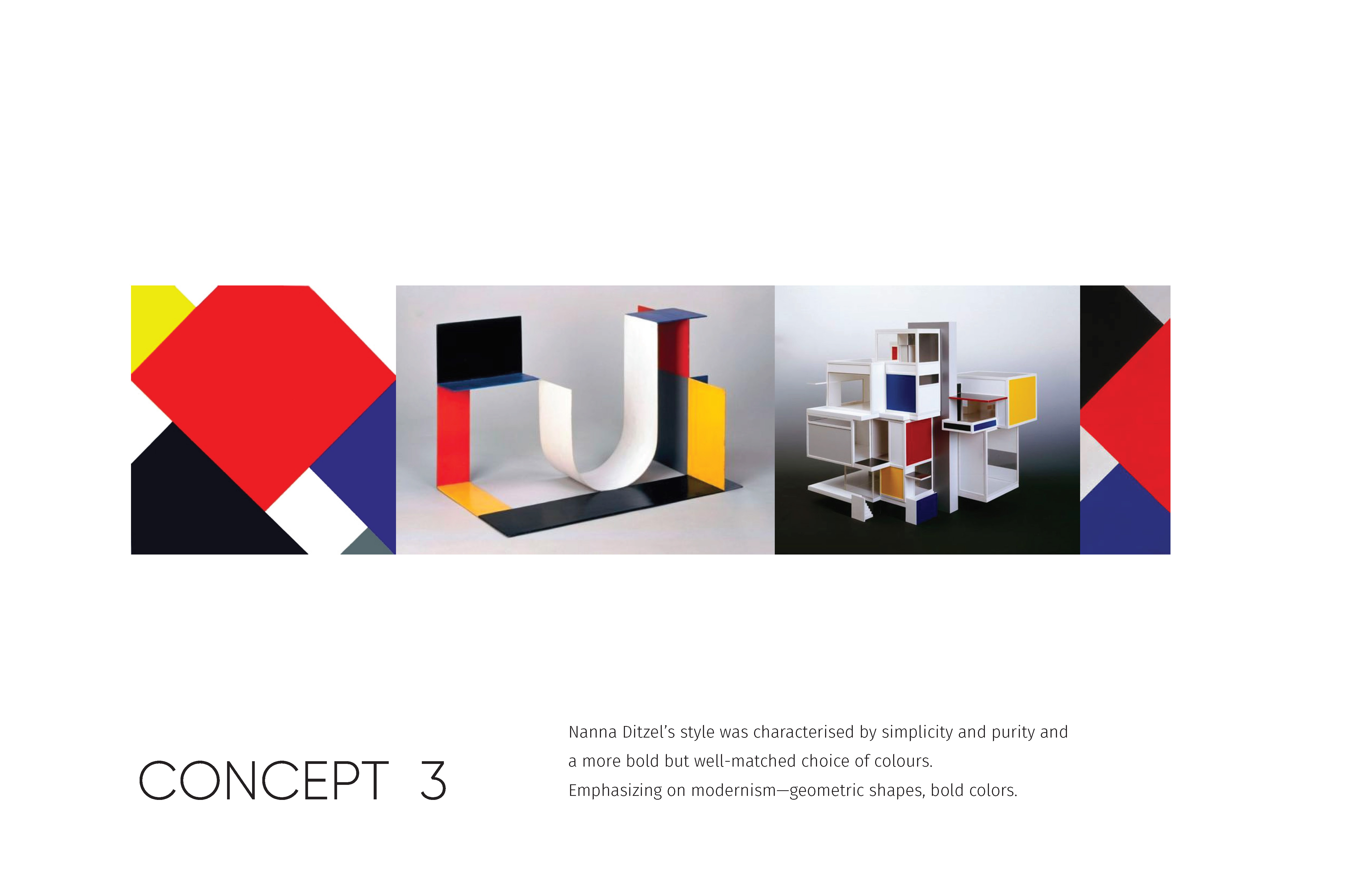
Nanna Ditzel (1923-2005) was probably the most internationally acclaimed female designer in Denmark. Her style was characterized by simplicity, purity, and a more bold but well-matched choice of colors. She often combined colors that seemingly did not go together, but which she managed to balance nonetheless.

Inspirations:
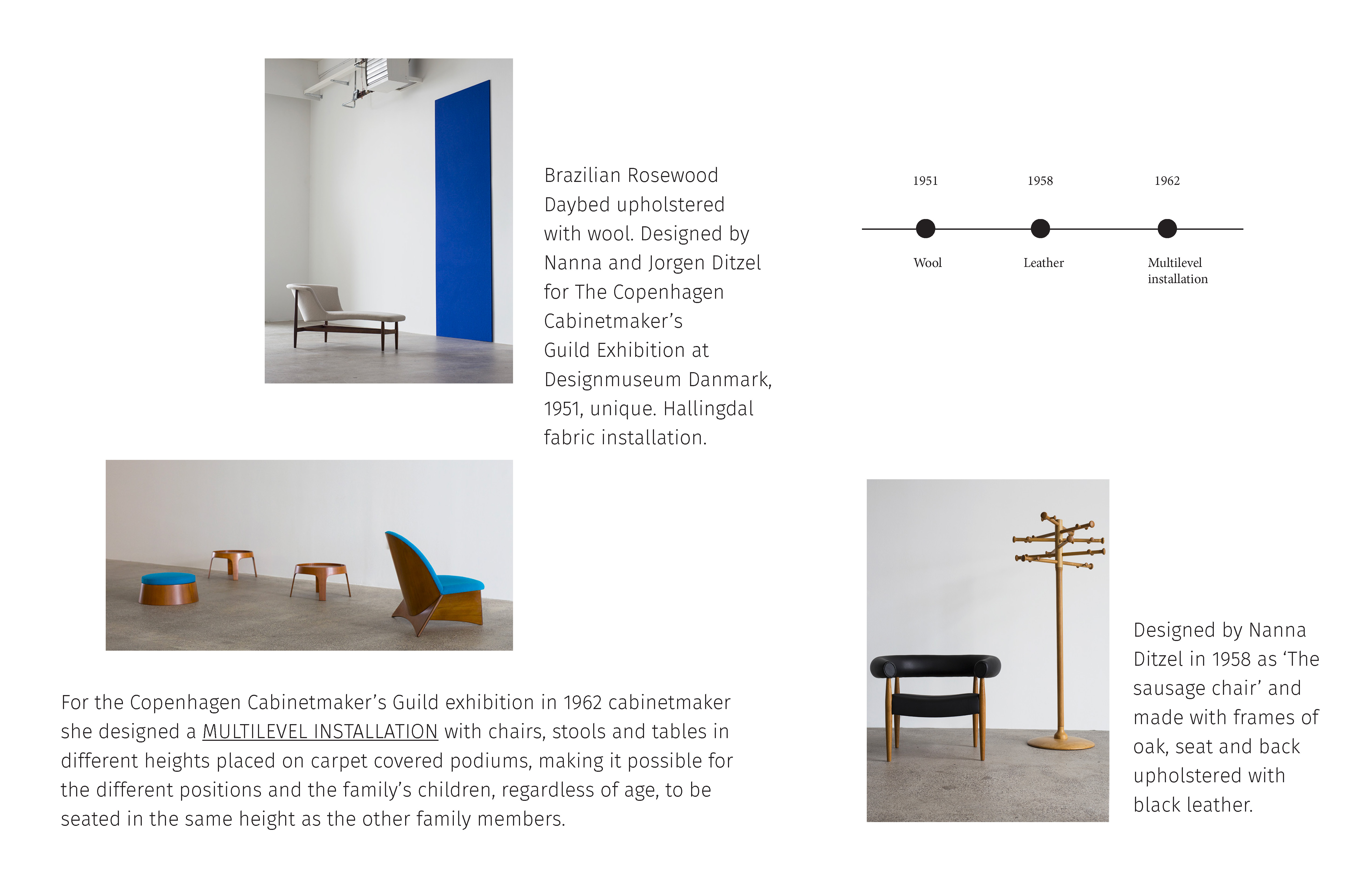
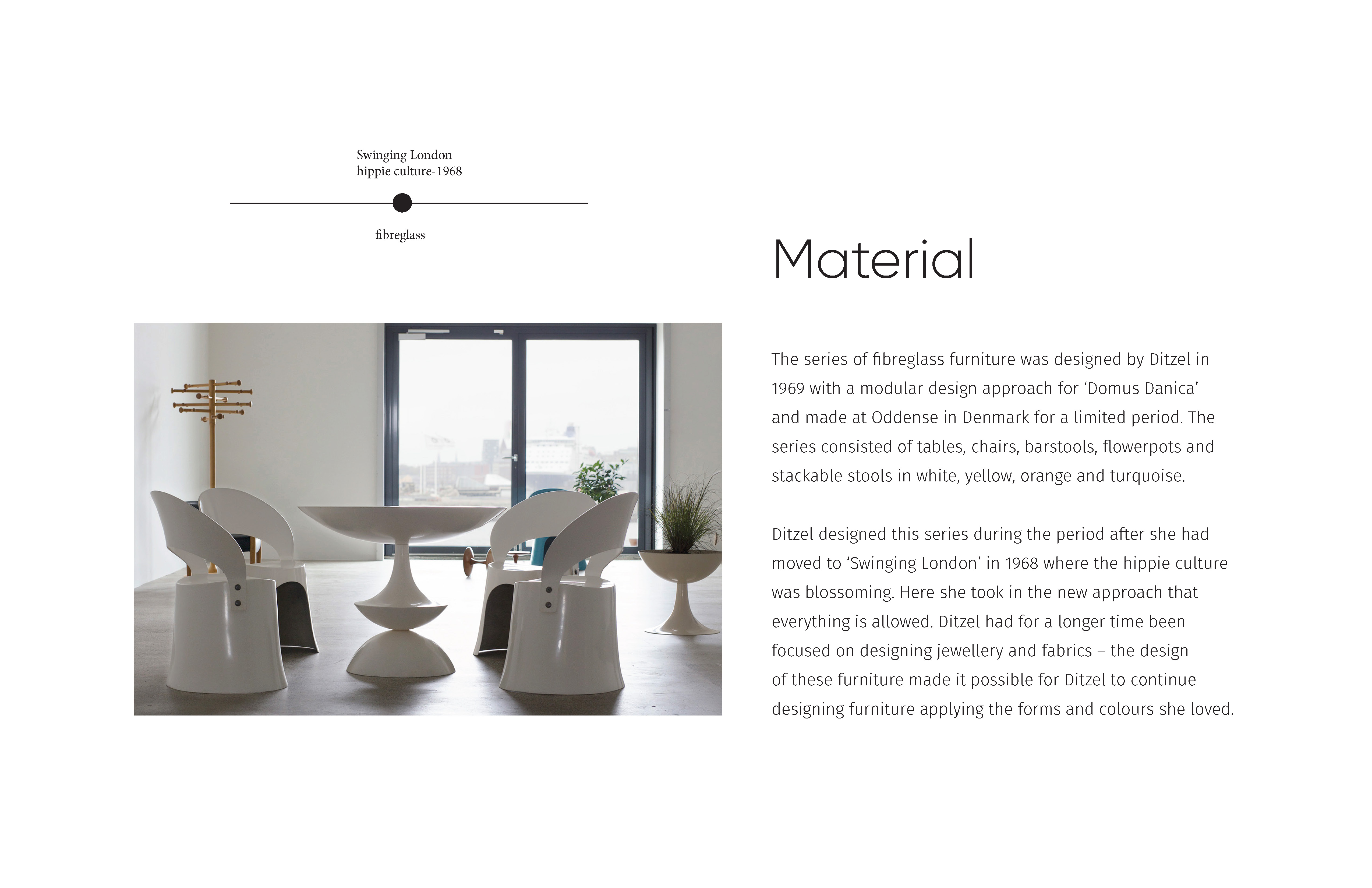
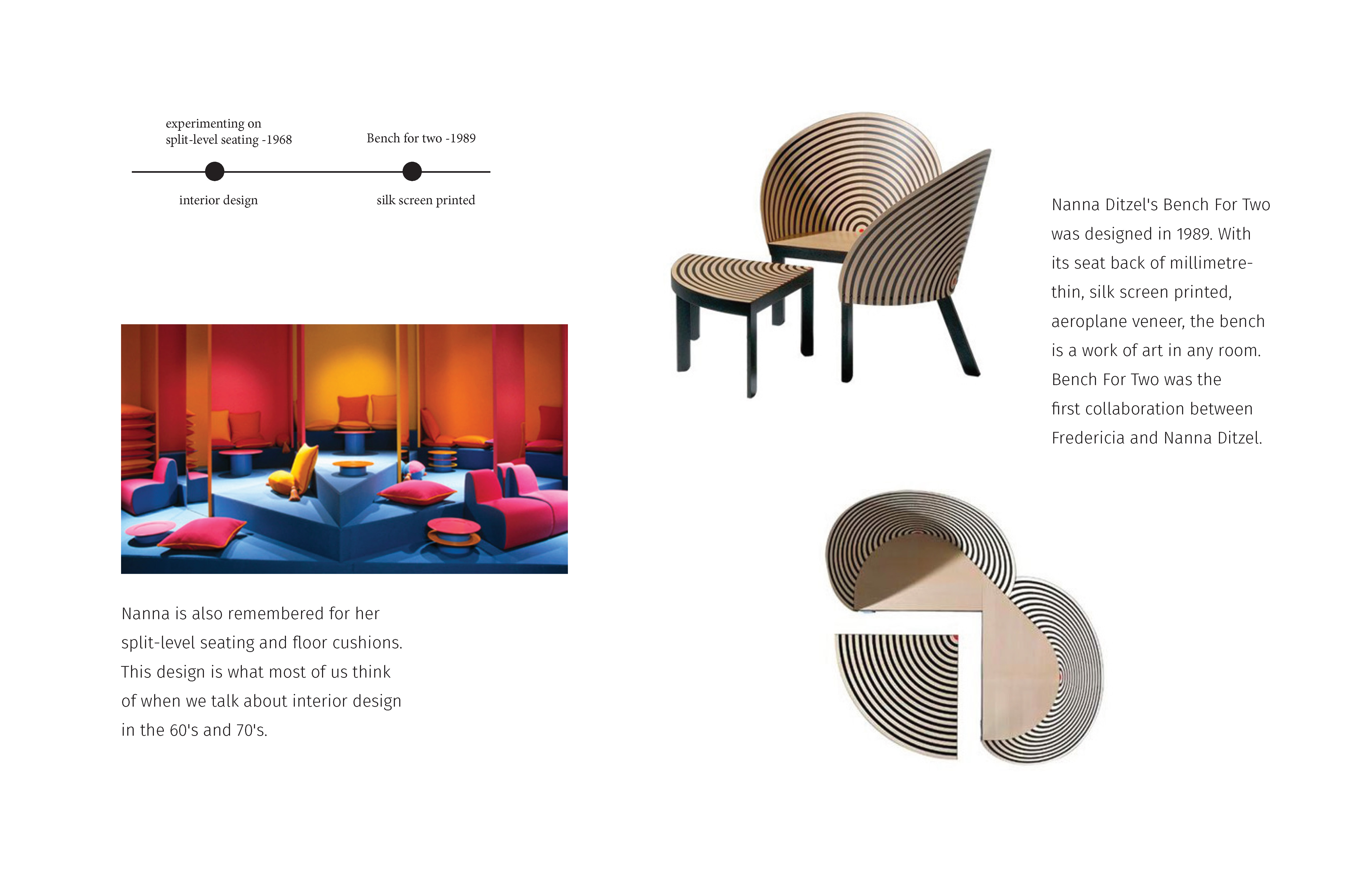
The career of Ditzel is marked by a desire for freedom. Known for her bold use of colors as well as embracing the quality of natural materials and organic forms, she had a magnificent ability to transform her artistic dreams into very functional and purposeful designs, but ones that were more decorative and curved. She always worked with various materials and techniques, such as fiberglass, wickerwork, and foam rubber, and in several disciplines, such as cabinet making, furniture, interiors, jewelry, tableware, applied art, and textiles.


Status:
1. The exhibition held for the Danish designer Nanna Ditzel
2. Separated the exhibit space into several rooms
3. The overall narrative outline and layout within the gallery has been refined
4. Completed the initial spatial layout to determine graphic sizing and placement
5. Completed initial component design
Intro:
Ditzel’s work often made use of color and organic forms and is widely celebrated for its timeless functionality. Ditzel’s designs were functional but more decorative. She used a lot of curves in her furniture designs. One of her favorite shapes was the butterfly shape, and I used this organic form as a key element in this exhibition design.
