2021
ARCTIC VISION - ITEAR 极目生物 极目生物
品牌设计,产品设计,移动端设计 • 生物医疗
 Brand Design
Interaction Experience Design
Industrial Design
Packaging Design
Special Thanks:
frog team 6-7 people
Brief:
Arctic Vision is a startup company based in China, focusing on eye disorder and disease treatments. frog SH has helped them shaping the comprehensive product experience of iTear, an OTC Dry Eye Syndrome medical device brand in Arctic Vision group portfolio, delivering the heal and rejoice to dry eye patients, as well as sustainable growth at scale to Arctic Vision’s business.

Key insight:
At the beginning, we tackled the project from the POV of ergonomics and usability in the first place. But not long after we started design research, our team revealed the psychological aspects of dry eye patients- We realized that a huge part of them suffer from anxiety, mental strain, even bipolar disorder due to the unpredictable flare-up of the syndrome.
At that moment, we realized that we have uncovered the underlying topic of this project, also the key to success in this product, which is to deliver a stress-free and soothing treatment experience to the patients, helping them get rid of the anxiety caused by the eye discomfort in their daily life.
Following the same core value from the product design phase, we thrived in creating a coherent, bright, and burden-free customer experience.
Products:
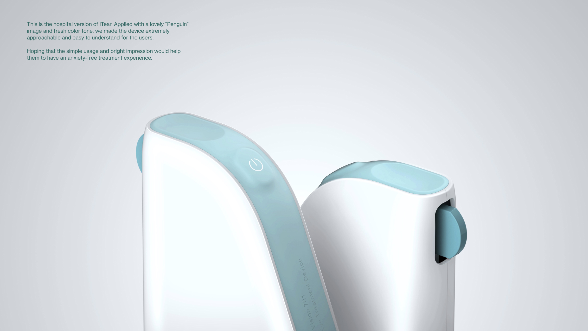
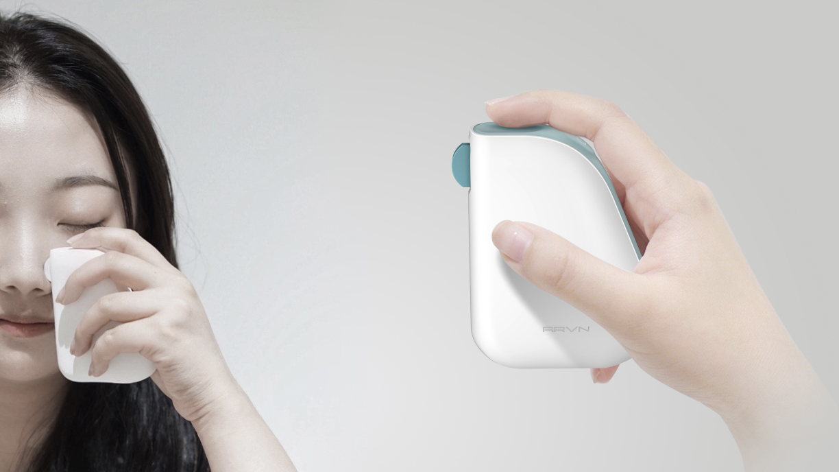
Hospital version of iTear. Applied with a lovely “Penguin” image and fresh color tone, we made the device extremely approachable and easy to understand for the users. Hoping that the simple usage and bright impression would help them to have an anxiety-free treatment experience.
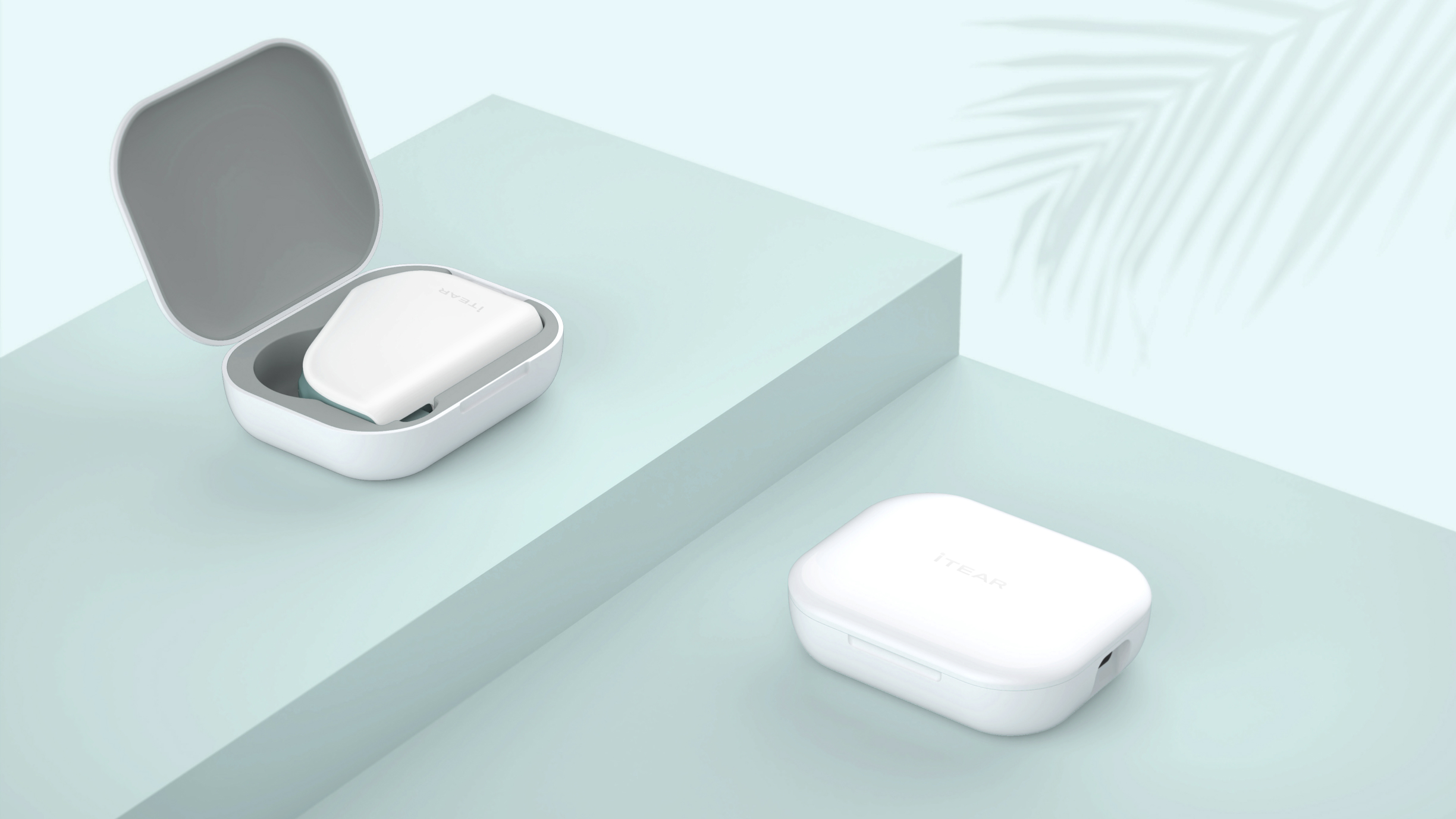
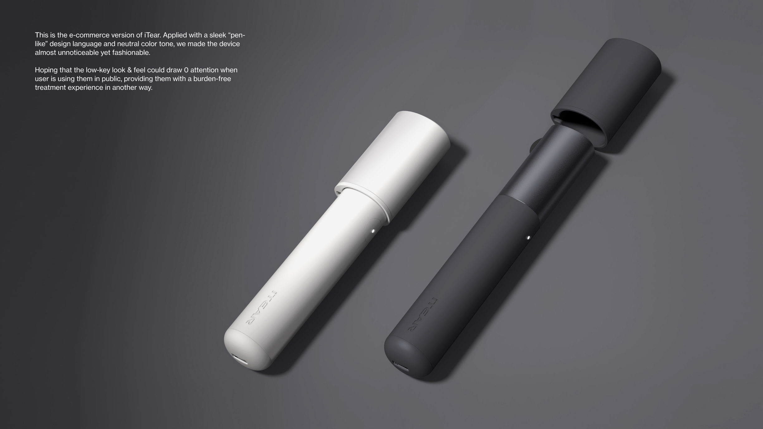
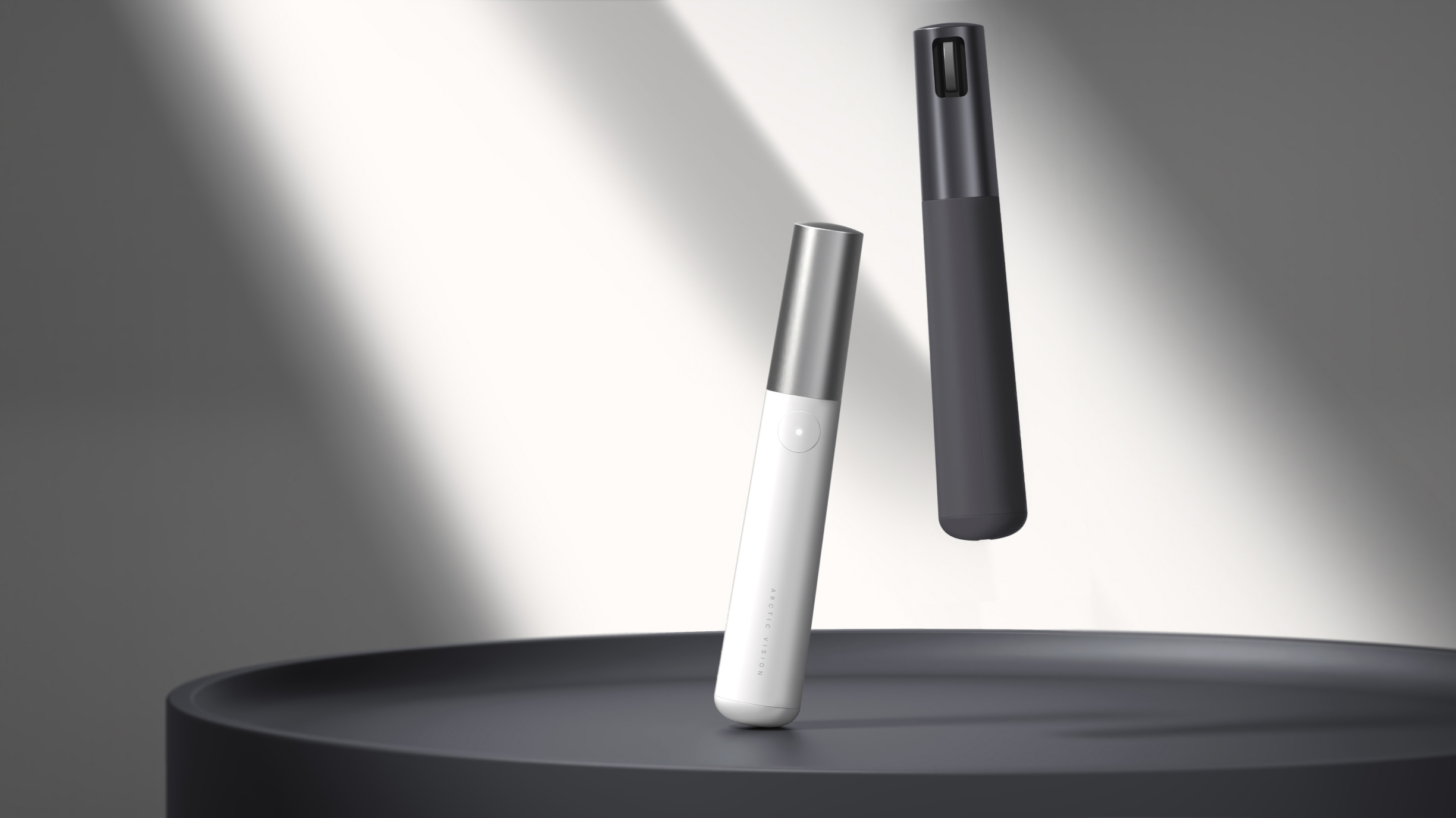
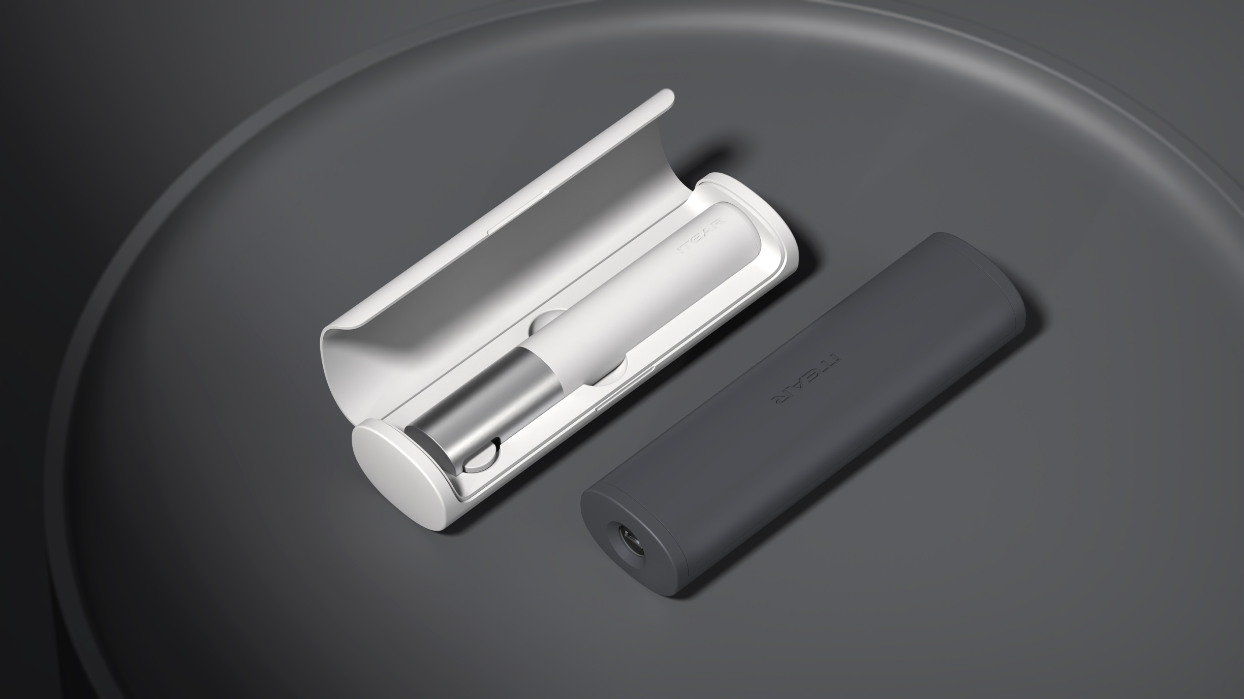
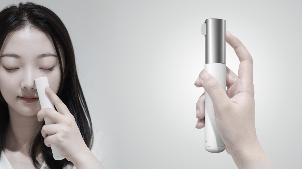
E-commerce version of iTear. Applied with a sleek “pen-like” design language and neutral color tone, we made the device almost unnoticeable yet fashionable. Hoping that the low-key look & feel could draw 0 attention when user is using them in public, providing them with a burden-free treatment experience in another way.


Rebranding:
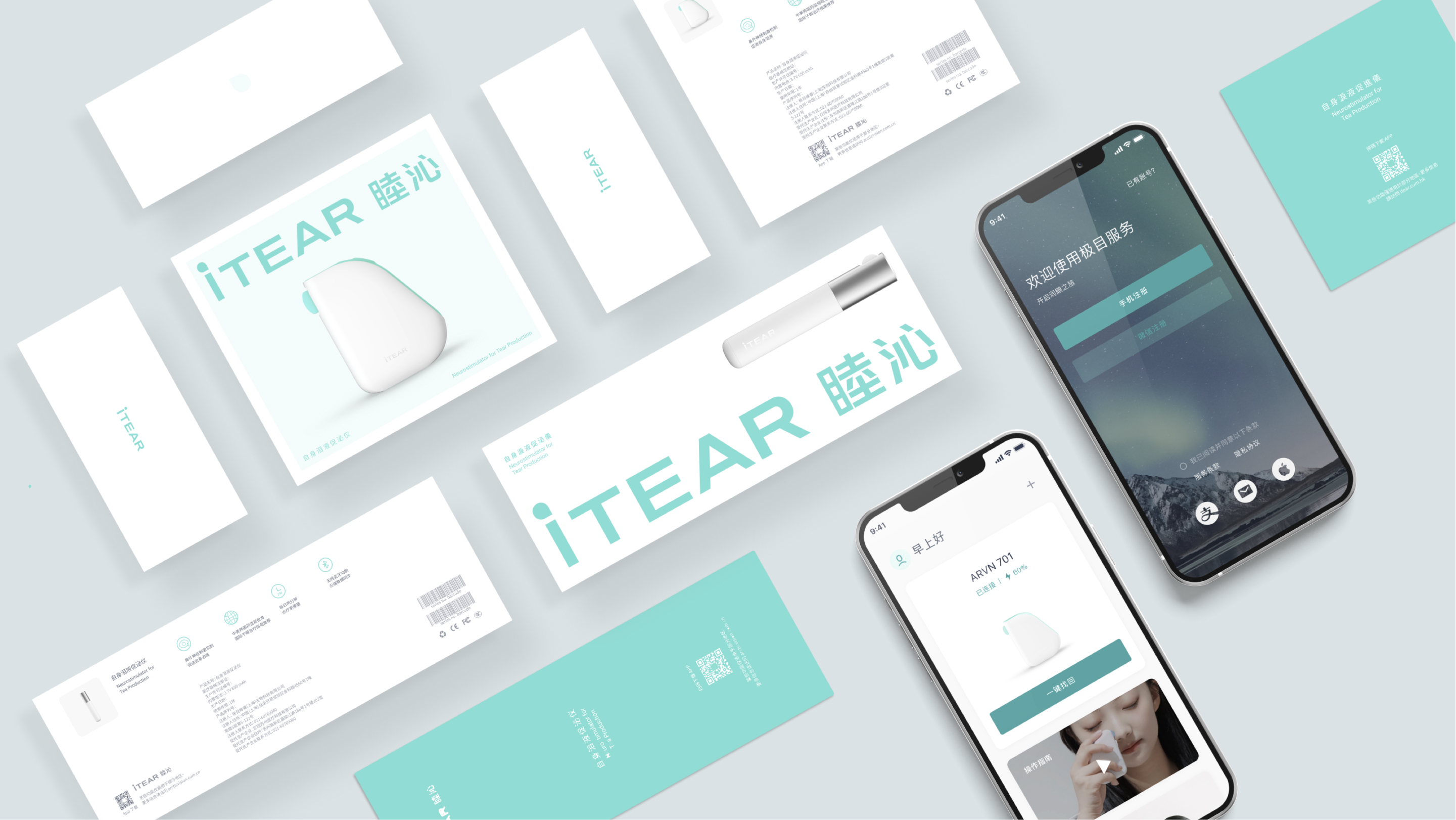
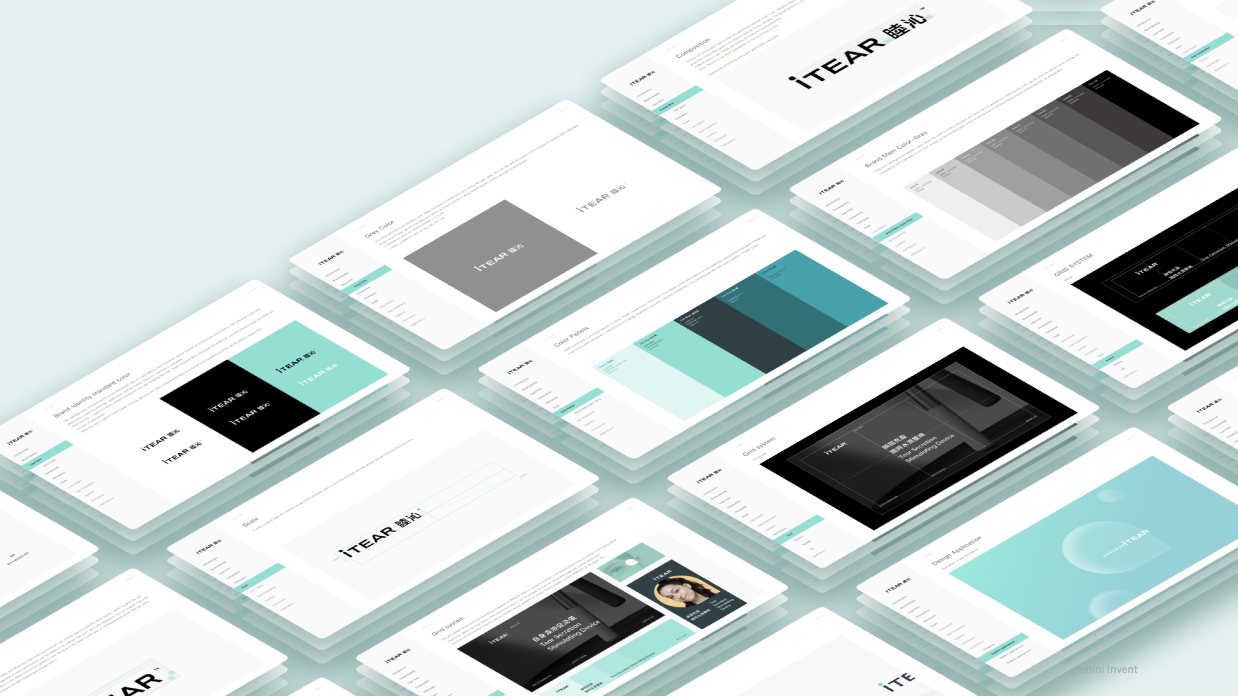
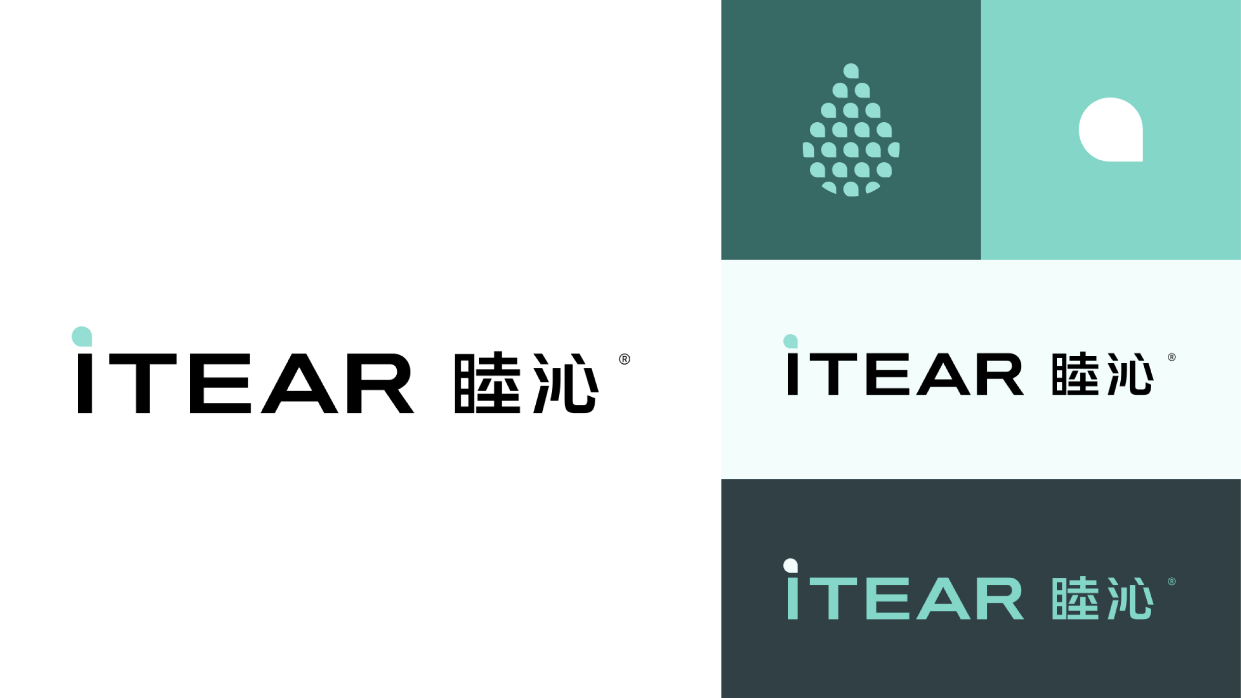
By combining Chinese e-commerce trends, competitor analysis, and interpretation of the company's vision and strengths, we refined the brand's unique mark – the lowercase "i" with a teardrop. With the teardrop spirit, we developed design application materials for the client.
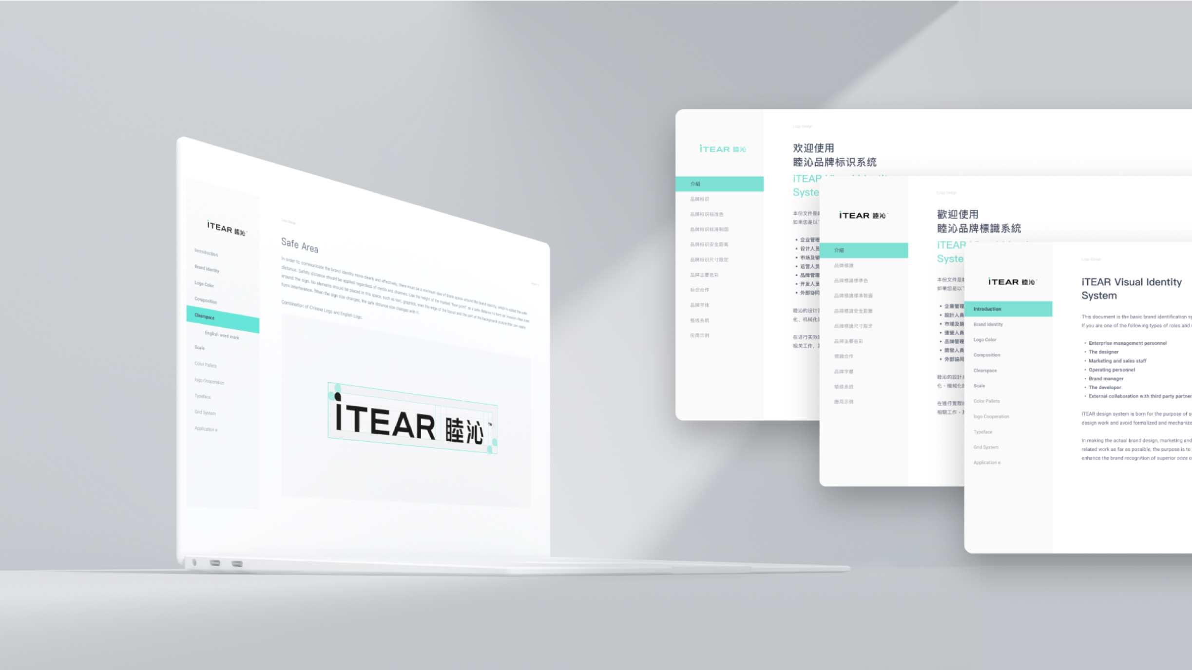
We finally delivered a multi-lingual version of the VIS, while building a more tech-savvy and user-friendly medical product brand across the 3 regions and creating a complete and consistent user experience through its adaption in the product packaging and the App.
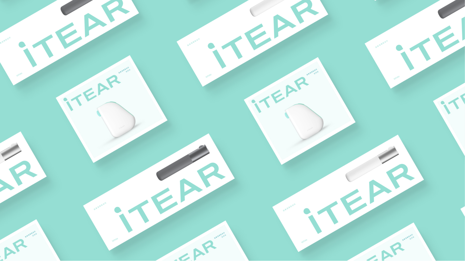
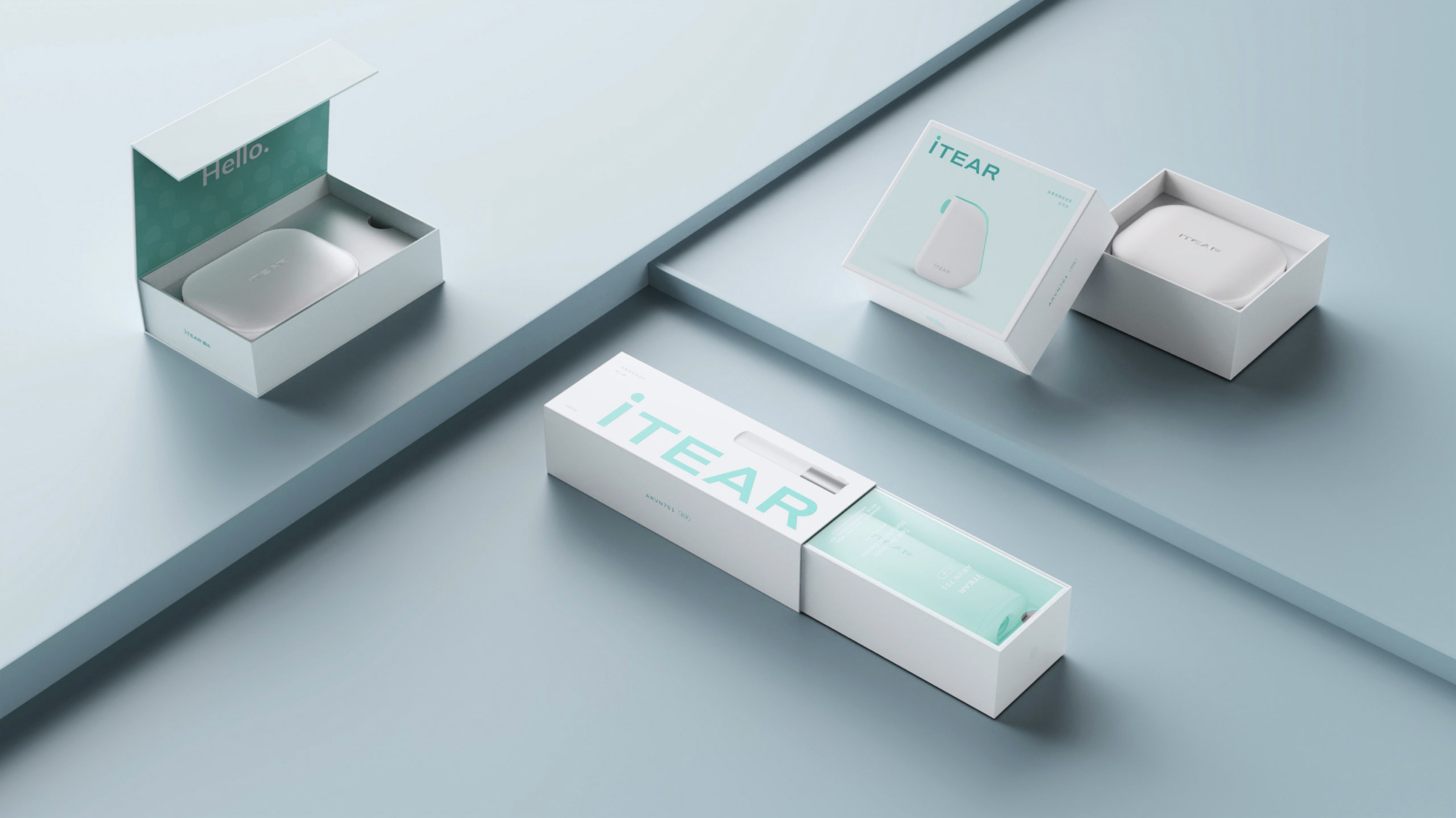
packaging:
Arctic Vision and frog concluded 2 product designs for iTear’s distribution channels of hospital and e-commerce, featuring professional, daily consumable and user-friendly.
The burden-free treatment experience went beyond the industrial aspect, with iTear’s packaging and Arctic Vision’s app renovated in line with newly applied brand visual identify systems designed by frog.
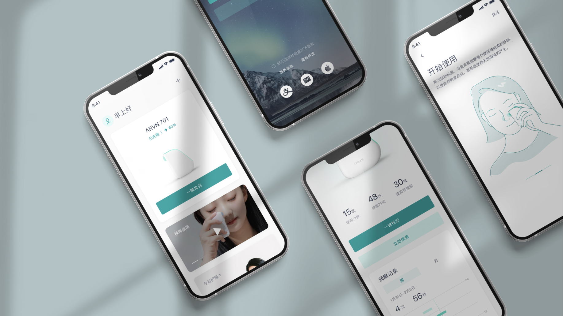

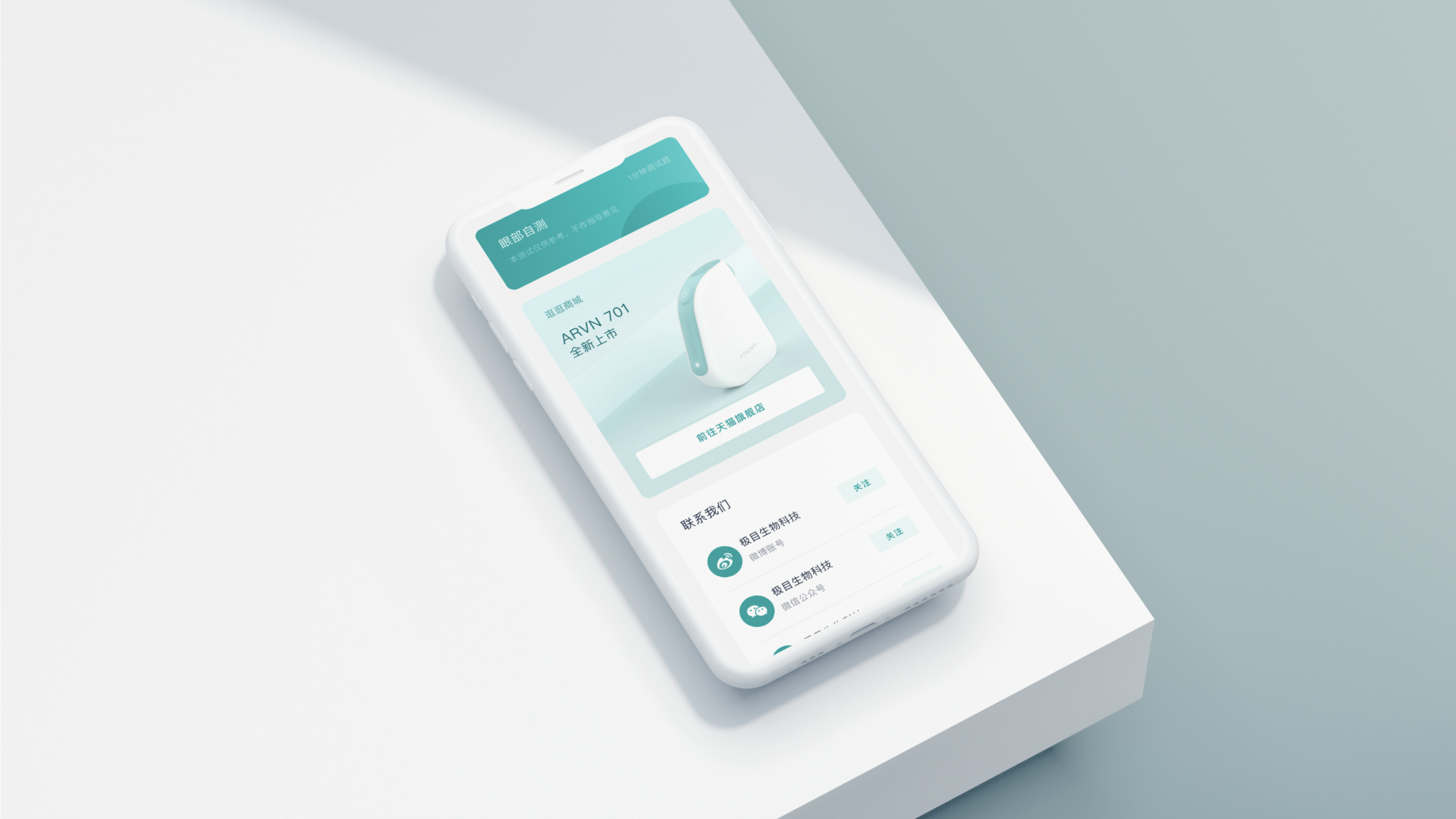
itear Mobile App
Easy Mode: The app consists of 2 main parts: the activation and usage history of the device, and other content to enhance interaction with the user.
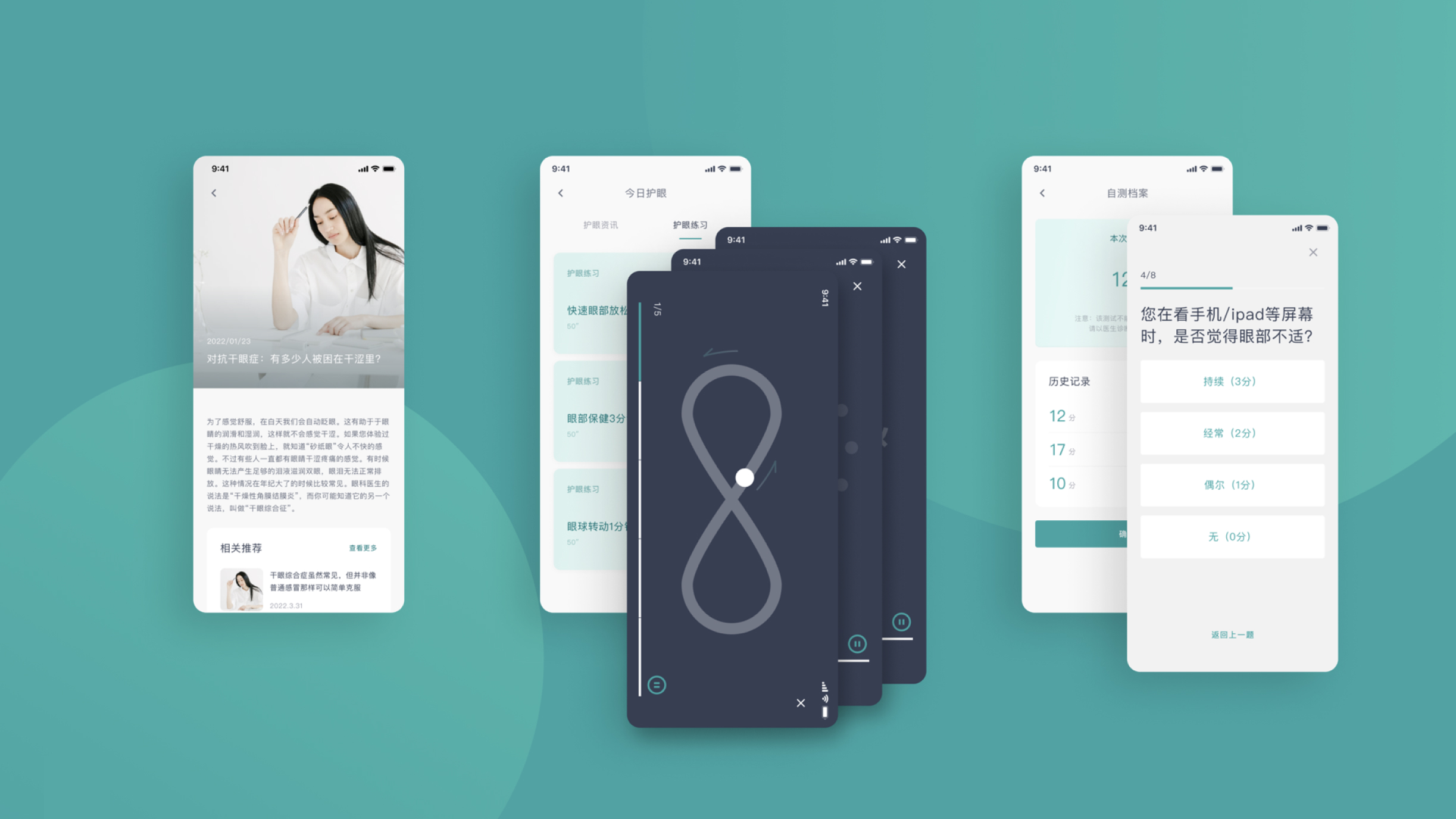
We proposed three content modules for enhancing user stickiness:
1. Daily Eye Care Articles
2. Eye Exercises
3. Eye Health Self-review Questionnaire